A Donor-First Experience: Reimagining Childfund’s Website

Childfund, a global nonprofit focused on child sponsorship and community programs, was suffering from an outdated website, a lack of design cohesion, and a lengthy and confusing donor portal and checkout flow. We led a comprehensive redesign that tackled the experience holistically, making everything from donating to sponsorship an easier and more enjoyable experience.

ChildFund webpage showing smiling children from different countries with text emphasizing the importance of children’s present.
Service
Design, UX, Product
Client
Childfund
Year
2025
Live Site
Childfund.org
ChildFund webpage showing smiling children from different countries with text emphasizing the importance of children’s present.
Down arrow
33%
checkout abandoment
Up arrow
41%
donor engagement
Up arrow
22%
mobile conversion
PROBLEM

Childfund’s outdated website was hindering donations.
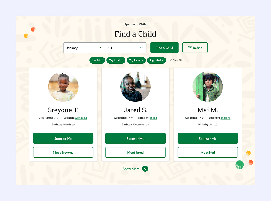
Childfund has been around since 1938. While their website might not be that old, they faced several product challenges as a result. The site lacked a coherent design system, with alarmingly low accessibility throughout. The primary revenue generating flow, Sponsor a Child, was confusing and lengthy. The checkout flow was a mess. And returning donors struggled with the dashboard. The result was friction, lower conversion, poor donor retention, and limited insight into a donor’s long-term impact.

ChildFund website pages showing child sponsorship options, a smiling girl, sponsorship benefits, and how sponsorship works.
Old Website
SOLUTION 01

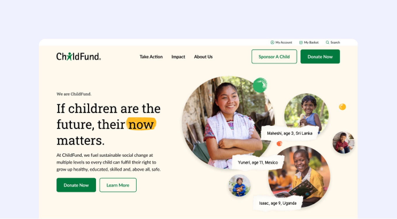
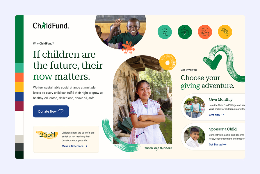
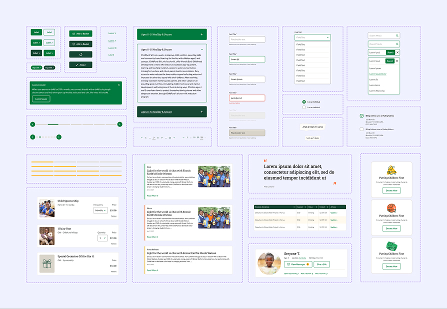
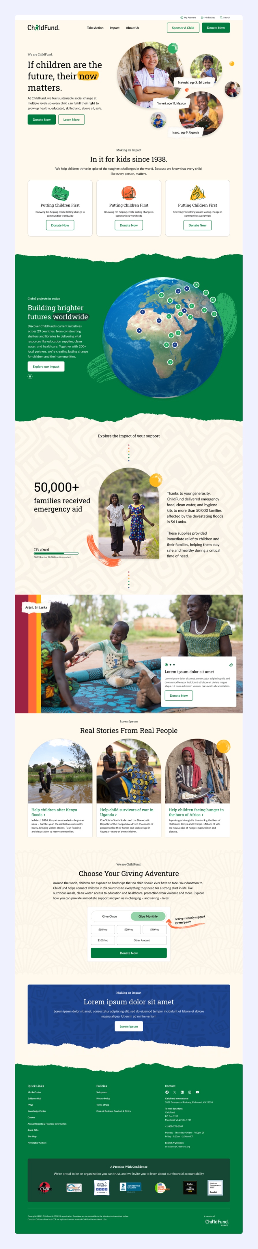
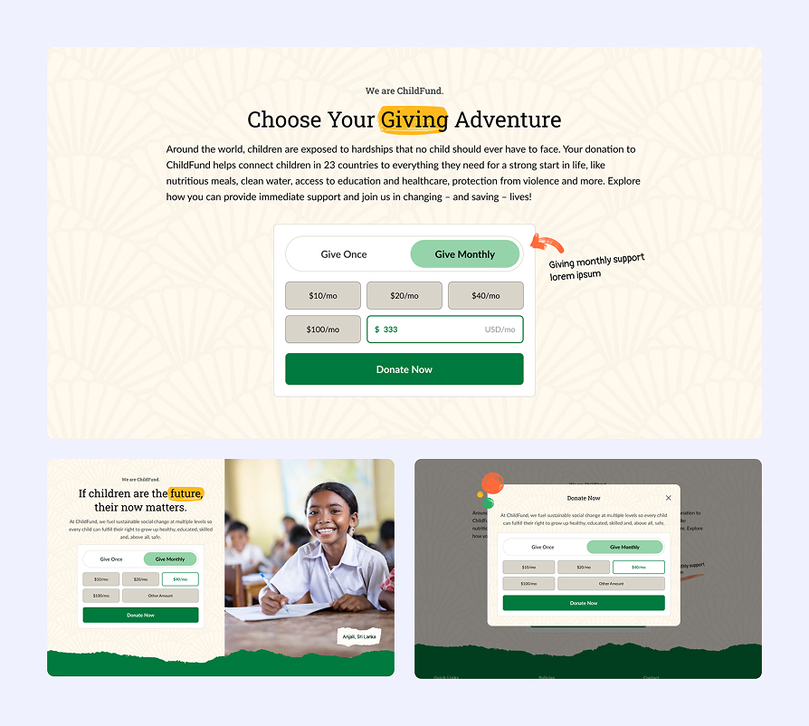
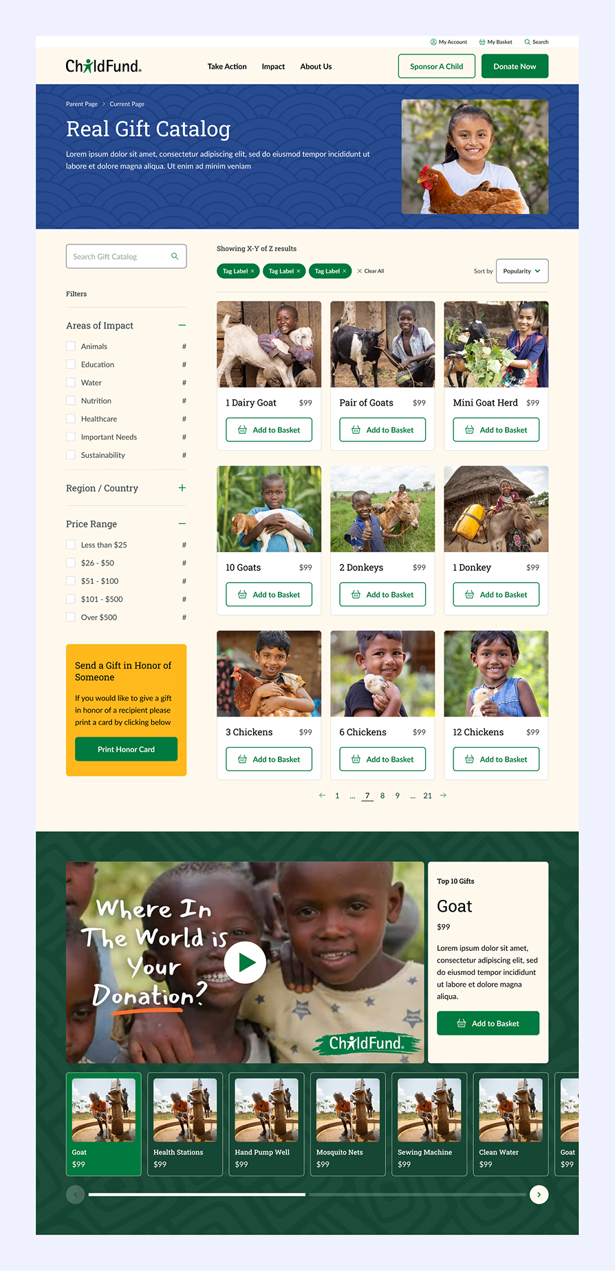
A modern design system.

We created a flexible, accessible design system built for scale across marketing pages, donation flows, and donor dashboards. A warm, neutral color palette was used to emphasize trust and hope. Background textures and patterns, drawing on international and cultural inspiration, alongside hand drawn brush strokes brought a fun and personal feel . Accessibility, better use of color, and mobile friendly designs were a prominent goal for the client. All of this combined with a modern component library and brand storytelling modules created a scalable design foundation enabling faster development and consistent UX.

ChildFund webpage showing two smiling children, advocacy for children's rights and options to give monthly or sponsor a child.
Brand Exploration
User interface design mockup showing various UI elements including buttons, forms, notifications, pagination, data tables, donation options, user profile card, and testimonial quote arranged in a grid layout with green and white color scheme.
Design System
ChildFund homepage showing children from different countries, a globe with project locations, emergency aid stats, real stories, and donation options.
Homepage
SOLUTION 02

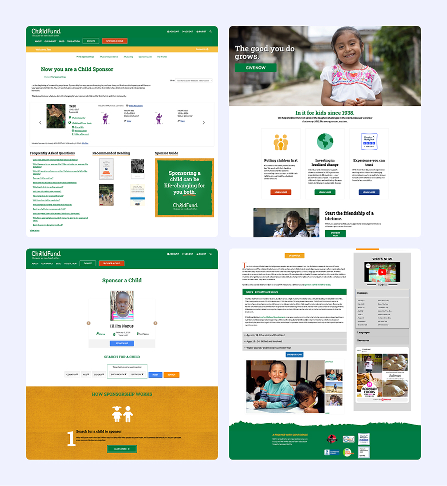
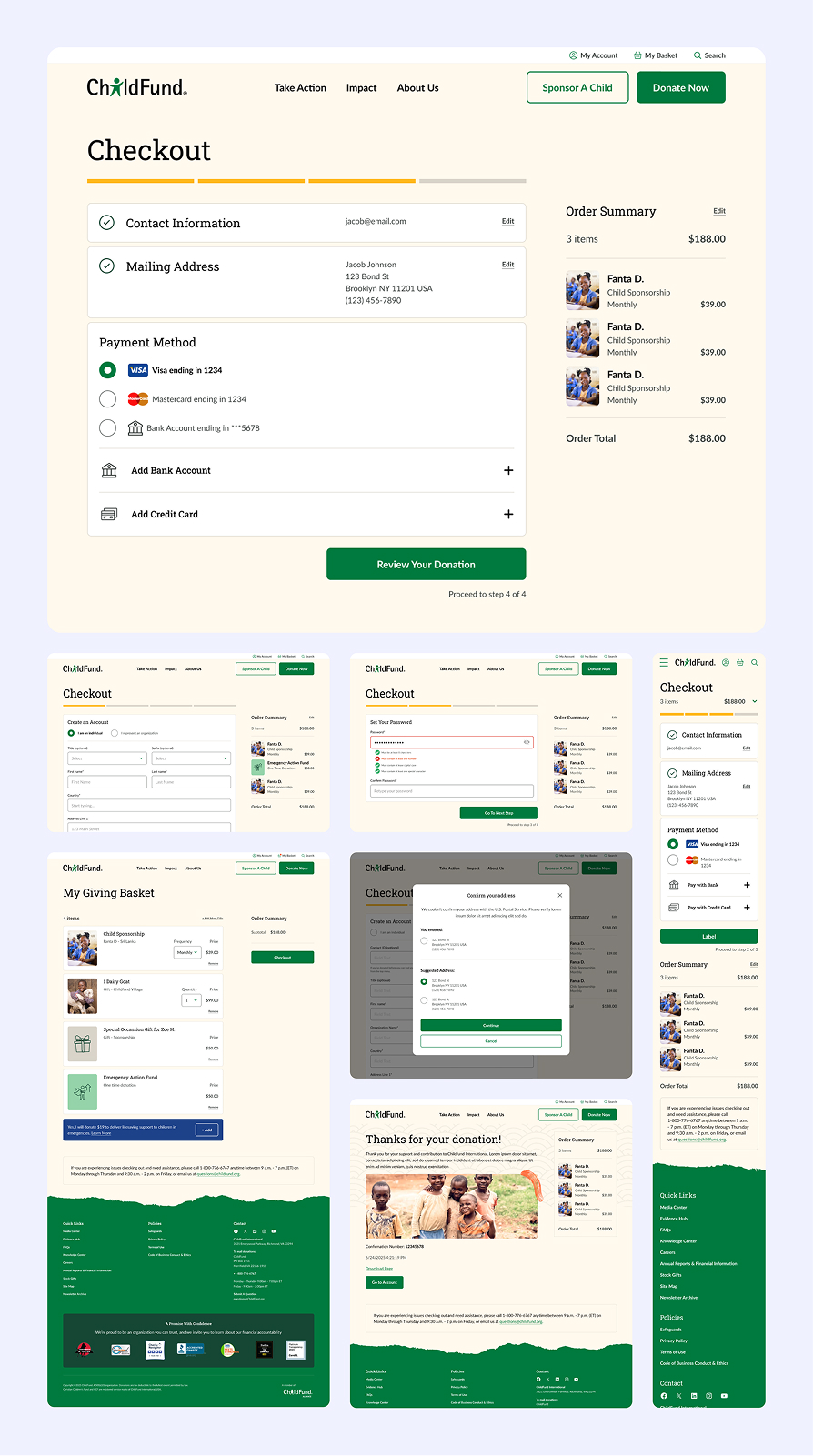
A streamlined checkout flow.

As the main purpose of the site, the donation and sponsorship checkout was rebuilt to reduce friction and increase trust. We created a simple three step guided flow, following best UX practices, that worked for both one-time and recurring donations. By reducing form fields, employing smart address lookup, adding trust indicators, and more we were able to design a smooth and friendly checkout experience across both desktop and mobile.

ChildFund online donation checkout page showing contact info, mailing address, payment methods, and order summary for sponsoring child Fanta D. with a $188 total.
Checkout Flow
Website interface to sponsor a child showing profiles of Sreyone T. from Cambodia, Jared S. from Sudan, and Mai M. from Thailand, with age ranges, birthdays, and buttons to sponsor or meet each child.
Sponsor A Child
ChildFund donation page showing options to give once or monthly with preset amounts and custom donation field, alongside a smiling student in a classroom, emphasizing support for children's futures.
Donate Form
ChildFund Real Gift Catalog webpage showing options to sponsor animals including goats, donkeys, and chickens, with photos of children and animals and a video thumbnail asking 'Where In The World is Your Donation?'
Gift Catalog
SOLUTION 03

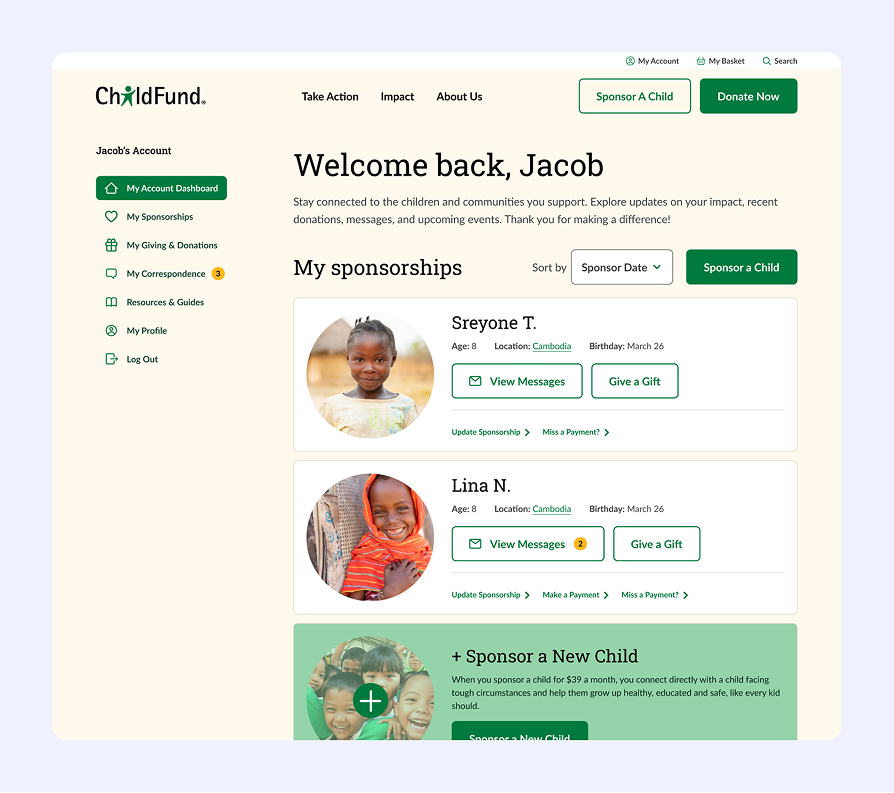
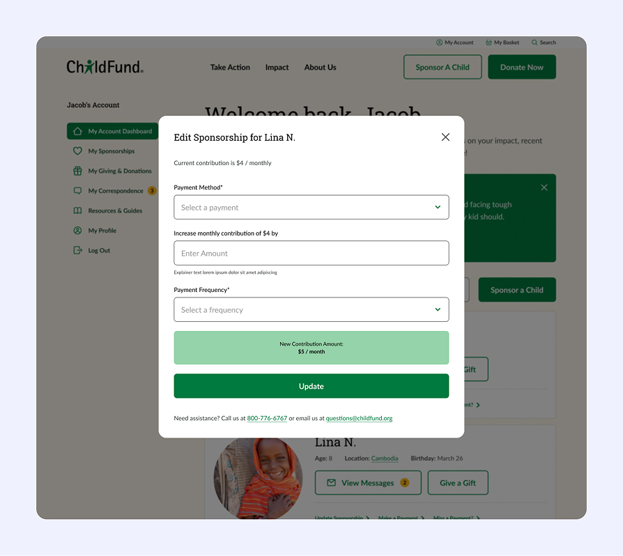
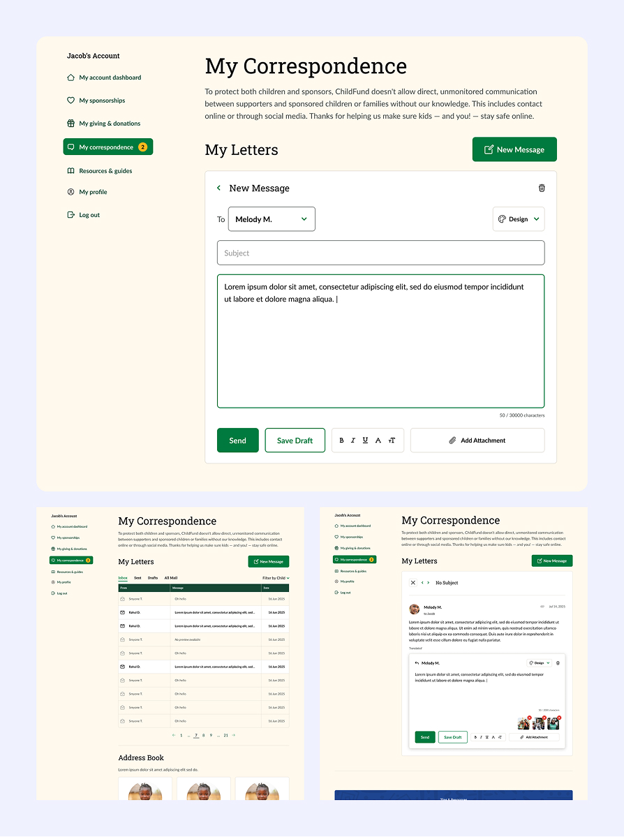
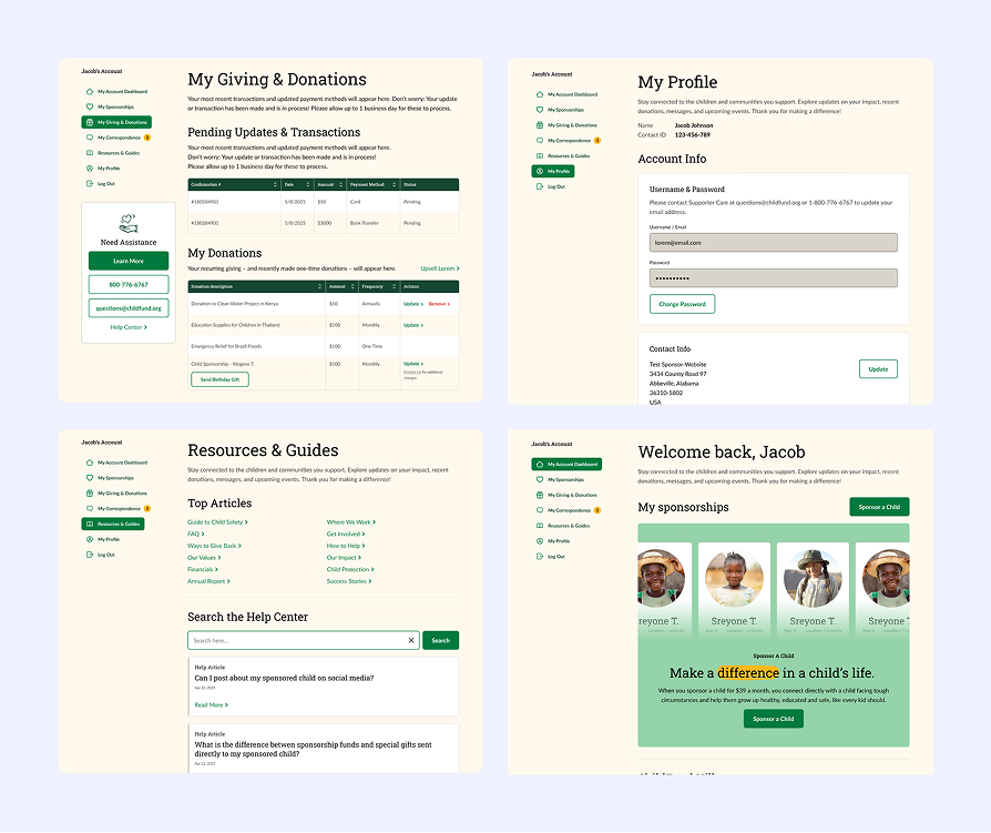
A clear donor dashboard experience.

A modern dashboard keeps donors engaged, informed, and connected with their impact.
With the new updated dashboard donors could view all sponsored children with profiles, letters, photos, milestones, and have a better sense of their impact, along with potential upsells. It also provided clarity around their account management tools, such as updating payment methods, managing recurring gifts, and downloading important tax information. This closed the loop, allowing donors to experience the ongoing value and connection that drives long-term retention.

ChildFund website dashboard showing sponsorships for two children aged 8 from Cambodia with options to view messages, give a gift, update sponsorships, and sponsor a new child.
Donor Dashboard
ChildFund account page showing an Edit Sponsorship popup for Lina N. with options to select payment method, increase monthly contribution, select payment frequency, and update contribution amount.
Edit Sponsorship
User interface of a 'My Correspondence' messaging section showing a new message form addressed to Melody M. with subject and message body fields, and side navigation menu including account dashboard, sponsorships, and correspondence.
Correspondence Screens
Four dashboard screens showing sections for giving and donations, profile details, resources and guides, and sponsored children with options to update payment methods, contact info, and sponsorship details.
Rest of Dashboard
RESULTS

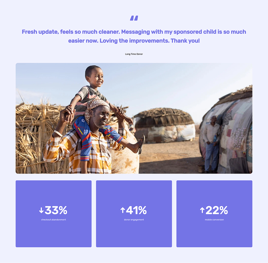
More personal. More trustworthy. And far more easy to use.

Though only recently launched, data already shows positive results. Donors reported that the experience felt more personal, more trustworthy, and far easier to navigate, strengthening both initial conversions and long-term donor relationships. Internal teams also gained a reusable design foundation that accelerated page creation and reduced inconsistencies throughout.

Smiling man carrying a happy child on his shoulders in a rural setting with huts, above three statistic blocks showing 33% decrease in checkout abandonment, 41% increase in donor engagement, and 22% increase in mobile conversion.